
The color wheel is an arrangement of several hues in a particular order. It is also most commonly known as the color circle. Decoding and comprehending the color wheel is not as simple as it sounds. Alas, luckily for you, we will go over each and every detail that is linked to the color wheel! Let us begin by understanding the meaning of color theory.
What is Color Theory?
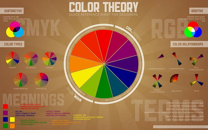
Before we give you all the juicy details about how to decode the color wheel, we must venture into the concept of color theory. So, what is color theory and how does it help us comprehend the color wheel? Well, color theory is the first step when it comes to deciphering the color wheel. This is so because it involves both the scientific and artistic methods in which color can be understood. It refers to the ways that colors mix, what visual aspects are unique to them, how color is perceived by human beings, how we can mix some colors, match them or even contrast them with each other! Lastly, color theory also includes the means used in order to create the colors. Apart from this, it gives significance to the meaning or feeling behind each color.
- What is Color Theory?
- Different Types of Colors
- Introduction
- Temperature of the Colors
- Historic Significance of the Color Wheel
- Terms To Know When It Comes To The Color Wheel
- How Can We Use the Color Wheel?
- What is Color Scheme?
- Benefits of Using the Color Scheme
- How To Make a Color Scheme Using the Color Wheel?
- Common Color Schemes to Take Inspiration From
- Triadic Colors
- Split Complementary Color
- Tetradic Colors
- Square Colors
Also Read: Clay Crafts Ideas: The Best Clay Crafts For Young Children
Different Types of Colors
Introduction
We already have the basic knowledge about the color wheel and how it illustrates the relation between each of the colors. However, these sets of colors have specific technical names. Fortunately, that is the second step in the decoding of the color wheel.
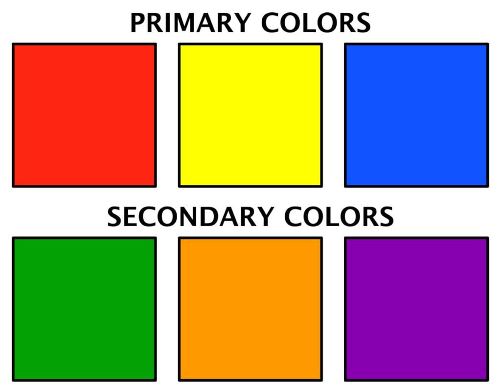
In the first category are those colors that cannot be created from other colors. These are red, blue and green. This means that these three colors cannot be made by mixing two separate colors and they stand on their own. They are called primary colors.
In the second category are the colors that are produced when the primary colors are mixed with each other. These are called secondary color. For instance, when one mixes yellow and blue, they can produce green. Similarly, when one mixes blue and red, they can create purple. Lastly, when one mixes red with yellow, they can make orange.
There are some colors which are referred to as complementary colors. These are the colors that are placed diametrically opposite to each other on the color wheel. These colors match with each other very well. Hence, many artists, as well as designers, take inspiration from these complementary colors to create combinations, as well as contrasts.
Along with these types, one can also find neutral colors. They chiefly comprise of black, white, brown, gray and shades of tan. They are generally paired up brighter colors but they can also be used in isolation. The effect that these colors have on an individual whether, physiologically or psychologically depends upon the colors around them. It can also depend upon the colors that the neutrals have been combined or contrasted with. These days, the neutral colors are considered to be very fashionable when it comes to trendy outfits and accessories!
Temperature of the Colors
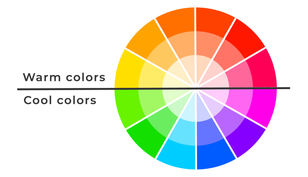
How fascinating does this sound? Do colors really have a temperature? Well, we cannot measure it on a thermometer but yes, colors do have a temperature. It affects how we perceive it and also brings in changes psychologically. To distinguish simply, the colors on the redder side of the color wheel can be identified as the warm colors. On the other hand, the colors on the bluer side of the color wheel are identified as the cool colors.
Warm colors mainly include red, orange and yellow along with shades of these three colors. Conversely, the cool colors are composed of blue, green and purple along with shades of these three colors. There are many interesting facts about the way that color temperature affects a human being. For instance, the objects which have a warm color seem closer to the individual viewing them. Nonetheless, the objects which have a cool color seem farther away.
Also Read: Watercolours Painting: Mistakes to avoid when painting with watercolours
Historic Significance of the Color Wheel
Isaac Newton, in his book called Opticks, had picturized an asymmetrical color wheel to highlight the relations shared by each of the hues. The divisions of the color wheel are unequal because it is based on the divisions of a musical scale. However, his color wheel only showcased the spectral colors, the purpose of which was purely related to the study of physics- it was to prove a rule about the colors of mixtures of light. Eventually, colors like purple and perhaps, its shades were also added to the color wheel. Many professionals prefer to call this the color circle and to use more primary colors such as red, green and blue.
If color theory and the color wheel have been mentioned then one other personality must also be mentioned. It was Goethe, who in his book called Theory of Colors, represented the first accountable study of the effects of colors physiologically which also led him to create a symmetrical wheel unlike Newton.
Terms To Know When It Comes To The Color Wheel
Knowing color theory and understanding the color wheel might not be enough when there are several terms that are associated with the color wheel. We have brought them to you in the easiest of ways!
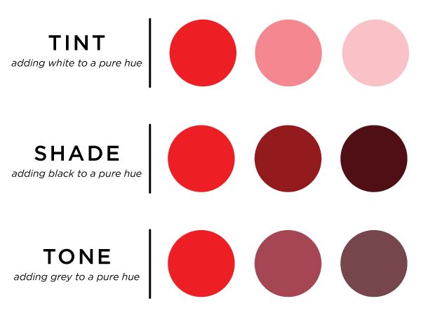
Shade
After a base color is selected, the shade is added on to it with the help of the black hue. This not only darkens the final color but also gives it a certain depth. However, one must be careful as too much of shade could make it totally overpowering.
Tint
Tint is very essential when it comes to finding the perfect balance between two or more colors. Unlike shade, where one needs to add black, for tint one needs to add white to the chosen base color which in turn will lighten the color. This will make it softer and less rich.
Tones
Tones are extremely fascinating as one can mix both black and white to the selected base color or gray to create tones. The tones are important as they disclose a shade which was not visible in the chosen base color.
Also Read: Amazing Benefits of Colouring for Children
How Can We Use the Color Wheel?
Color can be used to establish a psychological relationship with the one viewing it. For instance, commonly when asked about how the color red makes one feel, the responses are focused around words such as anger or perhaps, passion. In the same way, the color green is used to symbolize refreshment or rejuvenation. The color temperature theory is essential when it comes to deciphering how a color makes one feel because the warm colors are reflective of energy and excitement while the cool colors are reflective of calmness and peace. This indicates that colors are not just significant for the aesthetics but also have an everlasting psychological impact on human beings. It is through color that we associate or assign meanings to things.
One of the ways in which the color wheel can be used apart from creating works of art is in marketing products or services. Whether one needs to create a poster or sell a car, color theory is everything because research suggests that color plays a huge impact in the initial decision making mechanism of the consumer. In the same way that we a psychological reaction to colors such as red and green, consumers to respond to the colors of the product in the same manner. To create the perfect and desirable effect on the consumers one must have the most suitable color scheme.
What is Color Scheme?
A color scheme refers to the choice of the palette of colors used in the designing of a product or a advertisements or perhaps, bleven in a world of art. The default color scheme that we find is the white background with black text on it and this is called Achromatic. The color scheme can only be selected from the color wheel
Benefits of Using the Color Scheme
Apart from creating the desired psychological impact in the mind of the viewer, a good color scheme makes the entire object look more appealing as it adds value to the style as well as the aesthetics of the product. Monochromatic or complementary color schemes can be used with the help of the color wheel which might give an edge to the object being designed. Lastly, combining colors that are not obvious combinations or introducing a cool color against the background of warm colors help accentuate the color scheme and take it on a whole new level.
Designers and artists often have a hard time in trying to choose what they should include on their color palette. However, this is also a problem for the average person who is not sure how to decorate their house or which accessories to match with their outfit. Understanding how to create a color scheme, that suits one’s purposes, with the help of the color wheel is critical. Worried? Don’t be! We are here to help!
Also Read: Portrait Drawing: How to Draw a Portrait Step by Step?
How To Make a Color Scheme Using the Color Wheel?
When it comes to creating a color scheme for professional work it is best to stick to what the brand or the company requires from you. But, when one is producing a color scheme for themselves, they should go by personal preferences and choices such as, their favorite color or the color they think will be suitable for what they have in mind.
In the professional or artistic sphere, readability or comprehensiveness is very important. If the colors are all bright then deciphering the real message is very difficult for the viewer. On the other hand, if all the colors used are dull, the product or work of art will not be attractive enough to grab the attention of the viewer. Therefore, it is necessary to play around with the color wheel, in terms of the hues, saturation, tint, tones, brightness, shade, highlights among many others.
While testing out the color schemes can be done with the help of focus groups in the professional spheres, it is not possible for everyone and we advice one to rely on their instincts as that will certainly not disappoint them.
Lastly, just like all the trends circulating on social media at all times even colors have their trendiest times. It is essential to identify which colors are trending at the moment and according to that one can also influence their color scheme to make it more popular.
Common Color Schemes to Take Inspiration From
Apart from the color schemes which incorporate the complementary color or use the analogous colors there are several other concepts available and here we will go over a few of them!
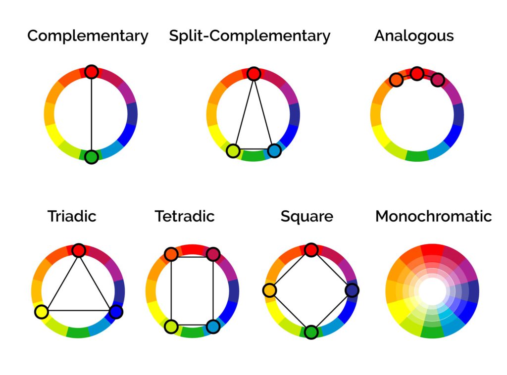
Triadic Colors
The Triadic color schemes are very sharp and bright. They are also very helpful in creating contrasts which always add a uniqueness to the work of art. The word ‘tri’ represents the number three. Here too, the Triadic color scheme includes three colors that are equally distanced apart on the color wheel. As the name suggests, it form the shape of a triangle.
Split Complementary Color
This method can be easily used if one is familiar with using the complementary colors. In other words, they are two colors opposite to each other which help in creating contrast. However, the only difference is that instead of two colors, one can utilize three colors from the color wheel. The two colors to be used are the diagonally opposite ones to the selected primary color. Once again, it creates a sort of a triangle on the color wheel.
Tetradic Colors
Unlike the other two color schemes, which create a triangular shape on the color wheel, this one creates a rectangular shape. It helps in choosing a pair of two complementary colors which will definitely work very well together.
Square Colors
Similar to the previous color scheme, the square colors can be created by selecting four colors on the color wheel. They are equally distanced from each other. This color scheme is generally used when looking for a color scheme with a higher contrast level. It definitely gives us a very bright and vibrant look.
That is how we decide the color wheel and understand all the intricacies associated to it. The color wheel can never be comprehended in isolation. Thus, going over these concepts is an absolute must in decoding the color wheel!
Also Read: Crayon Colours: The complete guide including best crayon colours
Share with your friends


