Before we divulge further into the world of Type Design, we need to understand what it is. Type design is the art and process of designing typefaces, which involves drawing each letterform using a consistent style. The art of designing letterforms intended for eventual manufacture as fonts, whatever the medium: lead, photographic, or digital.
Also, Historically, Typefaces were physical elements, called sorts, placed in a wooden frame. Modern typefaces used electronically and stored. It is the art of a type designer to develop a pleasing and functional typeface. However, it is the task of the typographer to lay out a page using a typeface. Typeface evolution has been slower than other areas of design but looking back over the past 500+ years shows staggering advancements, from the invention of the printing press to variable web fonts.
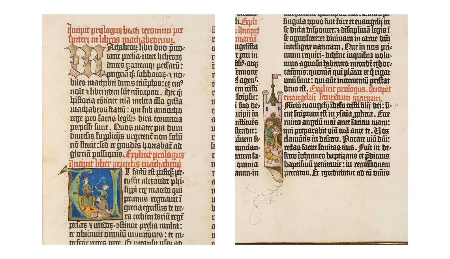
It’s easy to take books and other printed material for granted. Books however were written by hand; before the invention of the printing press by Johannes Gutenberg in the mid-15th century. Also, The availability of technology throughout the centuries has influenced Typeface history. Starting with Gutenberg’s press and continuing through digital typography advancements by designers in the 20th and 21st centuries.
Our basic mantra at Podium School is to provide our readers with the basic knowledge about a medium, in this case the world of Type Design. From there they can decide if or not to go forward.
The Basic Concept of Type Design

Below are the basic elements which make up a Typeface, in the world of Type Design.
Stroke
Also, Stroke defines the shape of designed letterforms and other characters arranged in a specific combination. These shaping and construction have a basis in gestural movements of handwriting. The factors surrounding its formation is what gives the stroke its visual quality. The stroke is the positive form that establishes a character’s archetypal shape.
Counter/ Counter forms
The spaces created between and around strokes are Counters. These negative forms help to define the proportion, density, and rhythm of letterforms. Counter is an integral element in Western typography; however, this concept may not apply universally to non-Western typographic traditions. More complex scripts, such as Chinese, which make use of compounding elements within a single character may additionally require consideration of spacing not only between characters but also within characters.
Body
The overall proportion of characters considers proportions of width and height for all cases involved, and individually for each character. In the former case, a grid system is used to delineate vertical proportions and gridlines (such as the baseline, mean line/x-height, cap line, descent line, and ascent line), while in the latter case, letterforms of a typeface may be designed with variable bodies, making the typeface proportional, or they may be designed to fit within a single body measure, making the typeface fixed width or monospaced.
Structural Groups
Characters with analogous structures can be grouped in consideration of their shared visual qualities when designing letterforms, in Latin, for example, archetypal groups can be made based on the dominant strokes of each letter. Verticals and horizontals (E F H L T), diagonals (V W X), verticals and diagonals (K M N Y), horizontals and diagonals (A Z), circular strokes (C O Q S), circular strokes and verticals (B D G P R U), and verticals (I J).
The Variables of Design
Type design takes into consideration several design variables, delineated based on writing system and vary in consideration of functionality, aesthetic quality, cultural expectations, and historical context.
Style
Style describes several different aspects of typeface variability related to character and function. It includes variations in:
Weight
Weight refers to the thickness or thinness of a typeface’s strokes in a global sense. Typefaces have a default medium which will produce the appearance of a uniform grey value when set in text. Moreover, categories of weight include hairline, thin, extra light, light, book, regular/medium, semi bold, bold, black/heavy, and extra black/ultra.
Variable fonts are computer fonts that can store and make use of a continuous range of weight and size variants of a single typeface, in the world of Type Design.
Case
A proportion of writing systems are bicameral, distinguishing between two parallel sets of letters that vary in use based on prescribed grammar or convention.
Further, uppercase or capitals is the larger case characters and lowercase, the smaller case characters. Other writing systems are unicameral, meaning only one case exists for letterforms. Bicameral writing systems may have typefaces with uni-case designs, which mix uppercase and lowercase letterforms within a single case.
Contrast
Contrast refers to the variation in weight that may exist internally within each character, between thin strokes and thick strokes. More extreme contrasts will produce texts with more uneven typographic color. At a smaller scale, strokes within a character may individually also exhibit contrasts in weight, known as modulation.
Posture
Also, The letterforms have a particular way of structuring. Which changes the angle between upright stem structures and the typeface’s baseline. This results in change of the overall posture of the typeface. In Latin script typefaces, a typeface is categorized as a Roman when the angle is perpendicular, a forward-leaning angle produces either an Italic, if the letterforms are designed with reanalyzed cursive forms, or an oblique, if the letterforms are slanted mechanically. A back-leaning angle produces a reverse oblique, or back slanted, posture.
Width
Each character within a typeface has its own overall width relative to its height. These proportions may be changed globally so that characters are narrowed or widened, typefaces that are narrowed are called condensed typefaces, while those that are widened are called extended typefaces.
The Future of Type Design
Variable fonts have had a significant impact on digital type design, but there’s still room for new trends and technologies to emerge in the future. One area where many typefaces are still lacking is global language coverage. Many typefaces focus on Latin character sets, there are other Western languages (such as Greek and Cyrillic) which should be more widely included as standard in font files.
Some areas of design change and evolve quickly, but typography has been slower to evolve over the centuries. Also, one emerging technology to watch is the development of colour fonts. These fonts allow designers to use multiple colours within a single glyph. While the technology to do this has been around for a few years, it hasn’t been widely adopted yet, however, web fonts were technically possible for more than a decade before they were widely adopted.
However if typeface history has demonstrated anything, it is that typography will continue to evolve to meet the needs of designers, new formats, and their readers.
Share with your friends


